August 17, 2026 6 min read
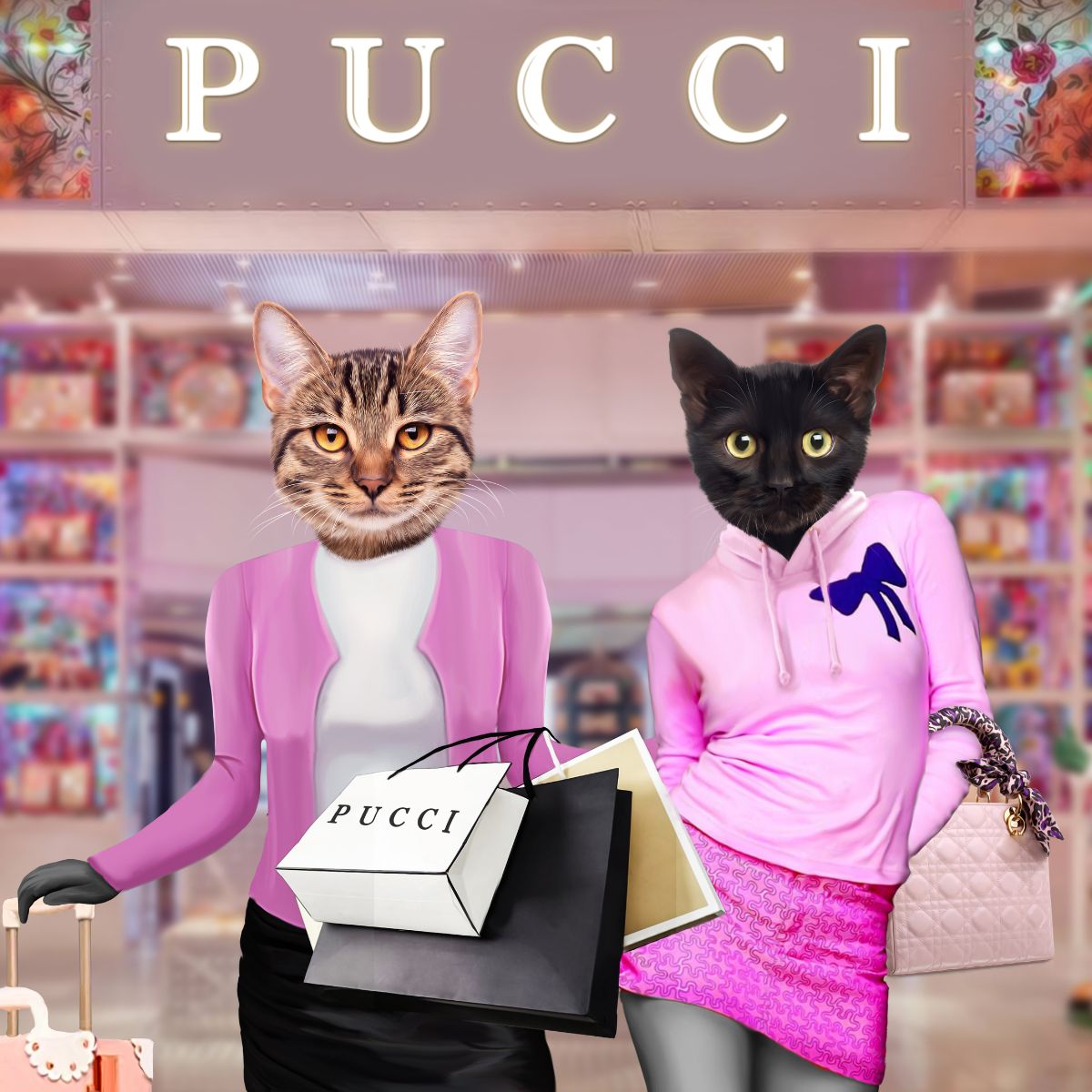
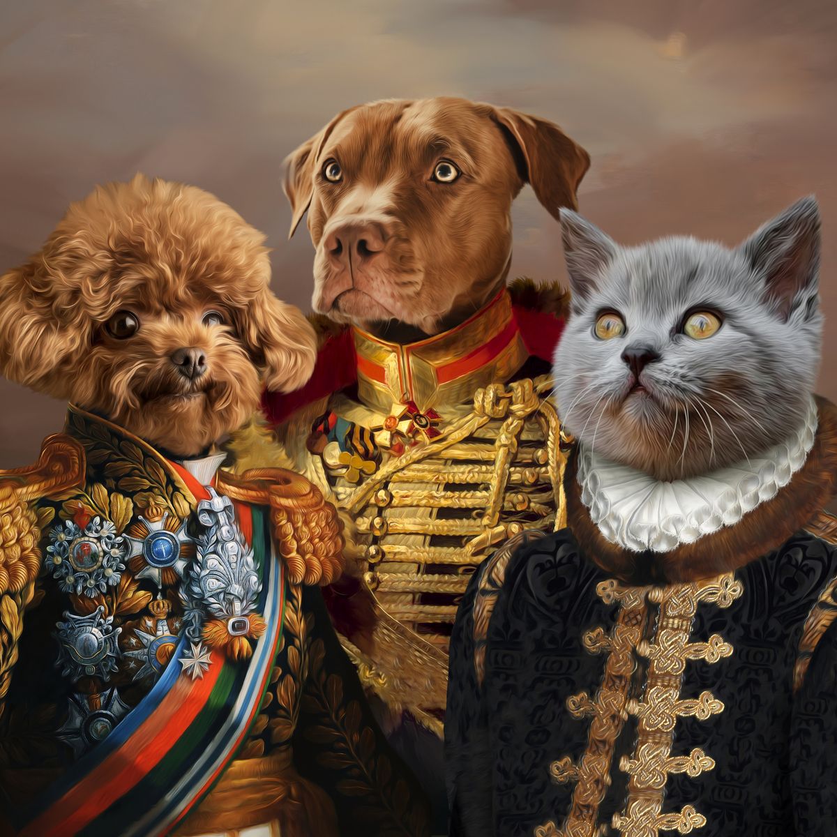
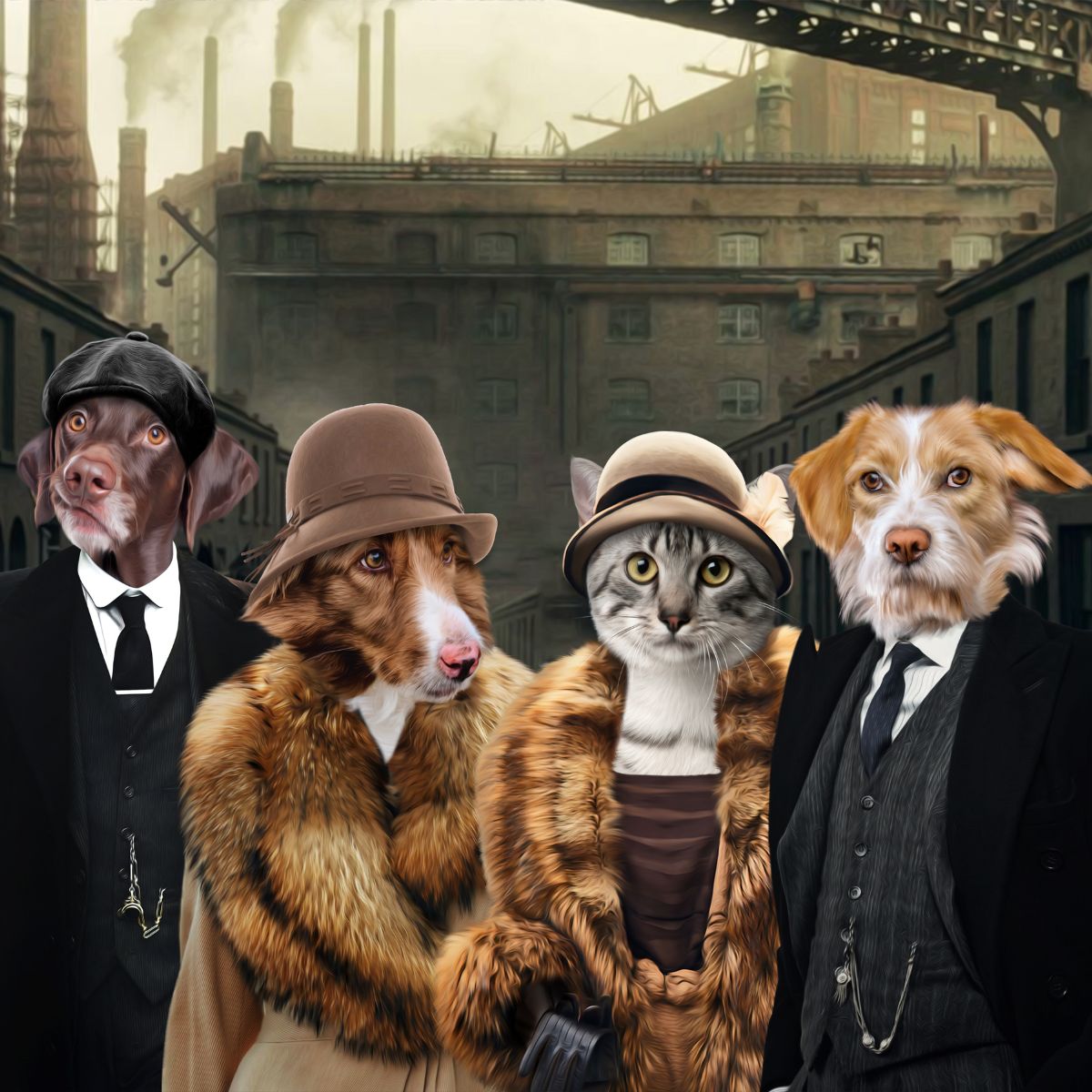
The background colour in a custom pet portrait has two jobs. It should help your pet stand out, and it should allow the finished artwork to sit comfortably in the room where it will live. Human beings naturally attempt to solve this by choosing their favourite colour first. Interior design, inconveniently, has other ideas.
The most reliable starting point is contrast: look at the lightness, darkness and warmth of your pet's coat, then choose a background that gives the face and fur enough separation to remain clear at a glance.
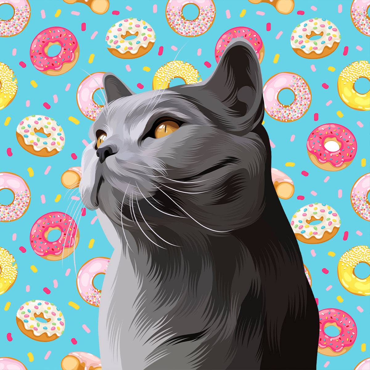
There is no single colour that suits every pet. The best background usually contrasts with the dominant tone of the coat without fighting the pet's natural colouring. Dark pets often benefit from lighter or mid-tone backgrounds, very pale pets usually stand out better against a little more depth, and highly patterned pets tend to suit calmer backgrounds.
After that, consider the room, the portrait style and whether the piece will be framed or printed on canvas.
Before thinking about cushions, curtains or whichever shade is currently being described as “timeless” by people selling paint, look at your pet. Is the coat mainly dark, light, warm, cool or multicoloured?
Contrast does not mean choosing the exact opposite colour. It means creating enough visual difference between subject and background that the outline, face and coat detail remain easy to read.
A black dog on a near-black background can look dramatic, but subtle fur detail may disappear. A cream cat on a pale ivory background can feel elegant, but only if the artwork has enough tonal separation to stop the two merging together.
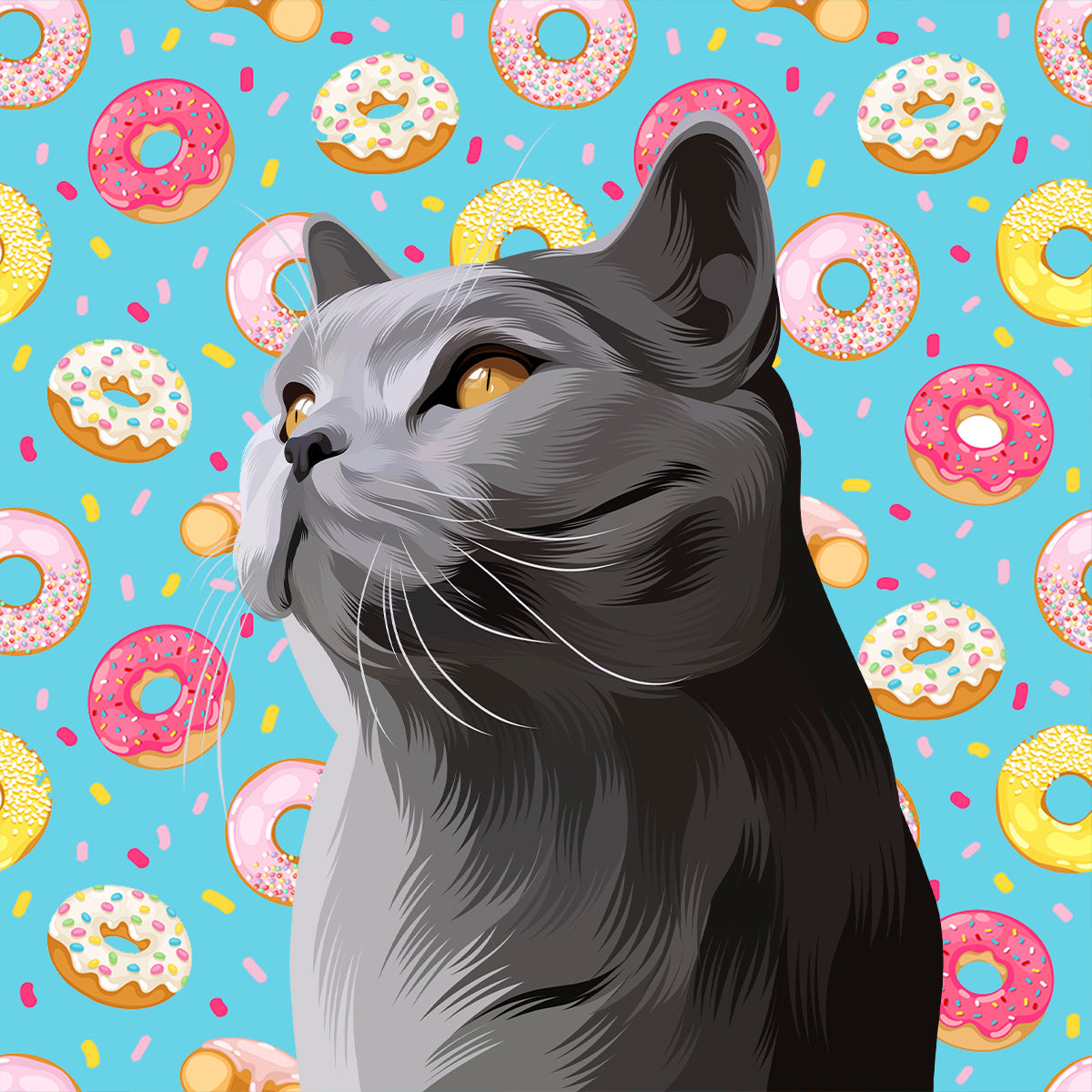
Black, charcoal and deep brown coats often look strongest against a background that is lighter than the fur. Useful directions include:
You do not have to avoid dark backgrounds altogether. Deep navy, forest green or burgundy can create a rich, editorial look if there is enough lighting and edge contrast around the face. The key is making sure the pet does not disappear into the backdrop like a very expensive shadow.
Pale coats usually benefit from a little more depth behind them. Consider:
White-on-white can work beautifully for a minimalist portrait, but it relies on careful shading and edge definition. If you want the pet to read clearly from across the room, a medium-toned background is generally the safer choice.
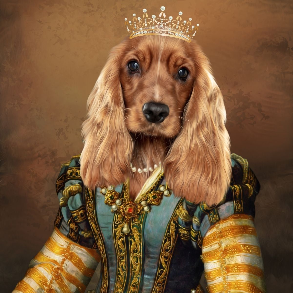
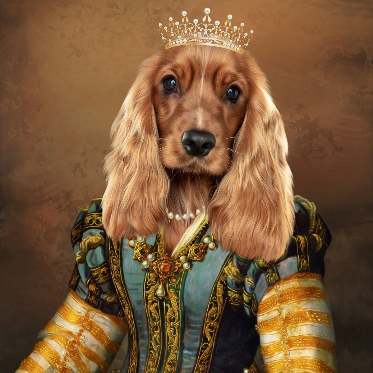
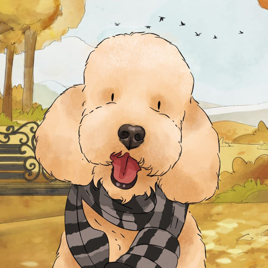
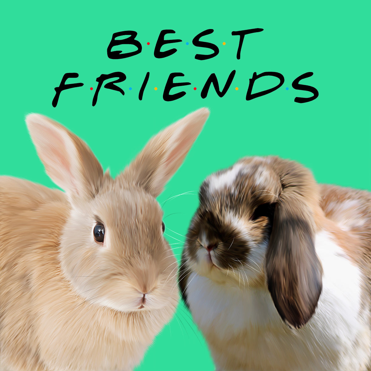
Warm coats pair well with colours that either complement their warmth or provide gentle cool contrast. Deep blue and navy can make golden fur look especially rich. Sage, olive and muted teal can work well with ginger and warm brown coats, while cream and warm stone create a softer, more neutral result.
Dusty pink can also work surprisingly well with warm fur when the portrait style is playful or editorial rather than traditional.
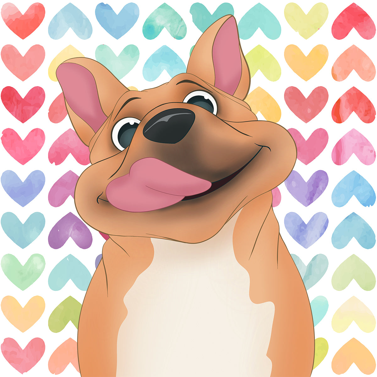
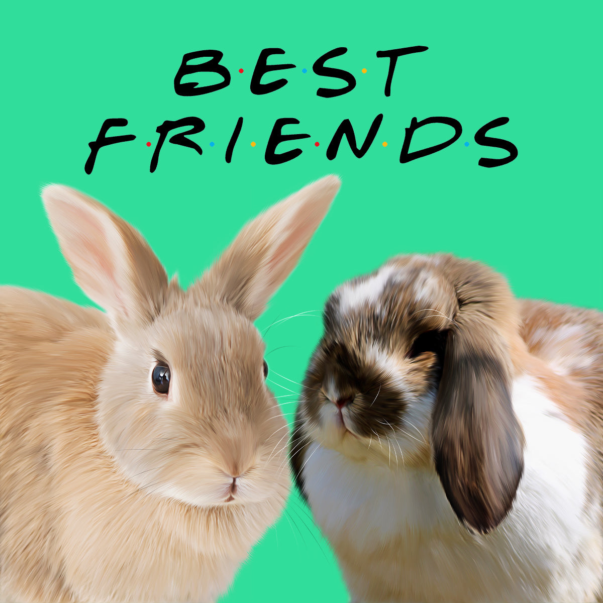
If your dog or cat has several strong coat colours, the background does not need to introduce yet another one. A calmer tone usually gives the eye somewhere to rest.
One useful approach is to borrow a quieter secondary colour from the pet or the portrait itself. For example, a black-and-white dog with warm brown eyes might suit a muted warm neutral, dusty blue or sage better than a highly saturated red.
For patterned coats, think “supporting actor”, not “second lead”. The pet has already arrived with a fairly comprehensive colour scheme.
Once you have narrowed the colours that flatter your pet, look at the room. You do not need to match upholstery or wall paint exactly. In fact, exact matching can make artwork feel oddly temporary when furniture or paint changes.
Instead, identify the room's broader character:
Frames matter too. A dark frame creates a strong visual boundary, while a light wood or pale frame softens the transition between portrait and wall.
Neutral does not have to mean beige. Muted navy, sage, dusty blue and soft charcoal can all behave like neutrals in a room while giving a portrait more presence.
Yes, slightly. A frame introduces another colour and creates a border between the artwork and the wall. That can make a stronger background feel more contained. Browse our framed pet portraits if you want a more defined, gallery-style finish.
With custom pet canvases, the artwork itself carries more of the visual weight because there is no separate frame boundary in the same way. A very strong background colour can therefore have a bigger effect on the room.
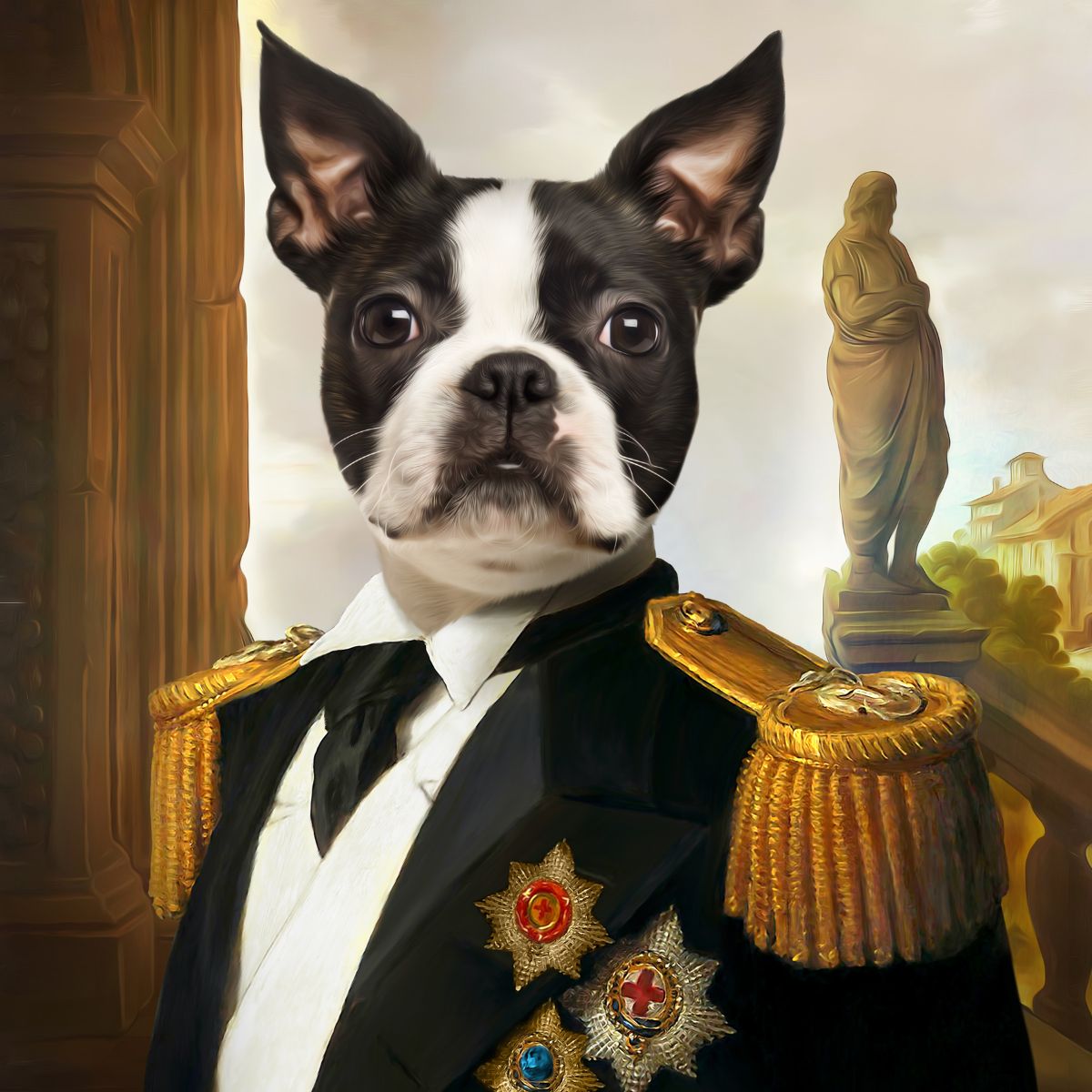
Not every design should have its background changed. Some portrait styles are composed around a particular palette, setting or costume, and changing the backdrop can weaken the overall artwork.
The sensible order is to choose the portrait style first, then choose a background colour where that design offers background options. Do not force a favourite colour into a composition that was built around something else merely because the colour exists on a paint chart.
It can, but it is not a rule. A muted version of an eye colour can create a pleasing link between subject and background, particularly with green, hazel or blue eyes. Exact matching is unnecessary. The goal is harmony, not forensic colour sampling.
Customers naturally inspect artwork close up, but wall art spends most of its life being viewed from several feet away. A useful test is simple: imagine the portrait at its intended size on the wall. Will the pet's face still separate clearly from the background?
If the subject and background are very similar in tone, subtle detail that looks lovely close up may flatten at a distance. Stronger tonal contrast is particularly helpful for smaller portrait sizes.
The spelling changes; the design principle does not. Whether you call it a background colour or background color, start with coat contrast, then consider the room and the portrait style.
Light or mid-tone backgrounds such as warm cream, soft blue, sage and stone are reliable because they separate dark fur from the backdrop. Deep colours can also work when the artwork preserves enough edge and facial contrast.
A medium or darker muted tone such as navy, sage, blue-grey or dusty rose usually gives pale fur clearer definition. Very light backgrounds suit a deliberately minimal look but need careful tonal separation.
It does not need to match exactly. It is usually better to choose a colour that belongs to the same warm or cool family as the room, or one that complements colours already present.
No. Background options depend on the individual portrait design. Some styles offer colour choices, while others are composed around a fixed setting or palette.
The safest background choice is the one that makes your pet immediately recognisable, complements the artwork and still feels at home in your room. Start with the coat, narrow the palette, then let your interior break the tie.
Explore our custom pet portraits, compare framed pet portraits and browse pet portrait canvases to see how different finishes change the overall effect.
Comments will be approved before showing up.
August 18, 2026 6 min read
Learn how to photograph a black or dark-coated dog or cat for a custom pet portrait, with simple tips on soft light, backgrounds, exposure, eye detail and phone photos.
August 18, 2026 6 min read
Can a screenshot, WhatsApp image or compressed phone photo work for a custom pet portrait? Use this practical checklist to decide when the image is good enough and when to find the original.
August 17, 2026 2 min read
WELCOME TO PAW & GLORY
Get 15% off your first order
Join 30,000+ pet owners turning perfectly ordinary photos into gloriously over-the-top works of art.
★★★★★ 2,200+ Five-Star Reviews
Real Artists · Proof Before Print · Unlimited Artwork Revisions