September 03, 2026 7 min read
A pet portrait with a name can look beautifully personal. It can also look as though the artwork has been introduced to several fonts and nobody had the authority to stop them.
The best approach is simple: add your pet’s name when it contributes something to the portrait, not merely because an empty corner exists.
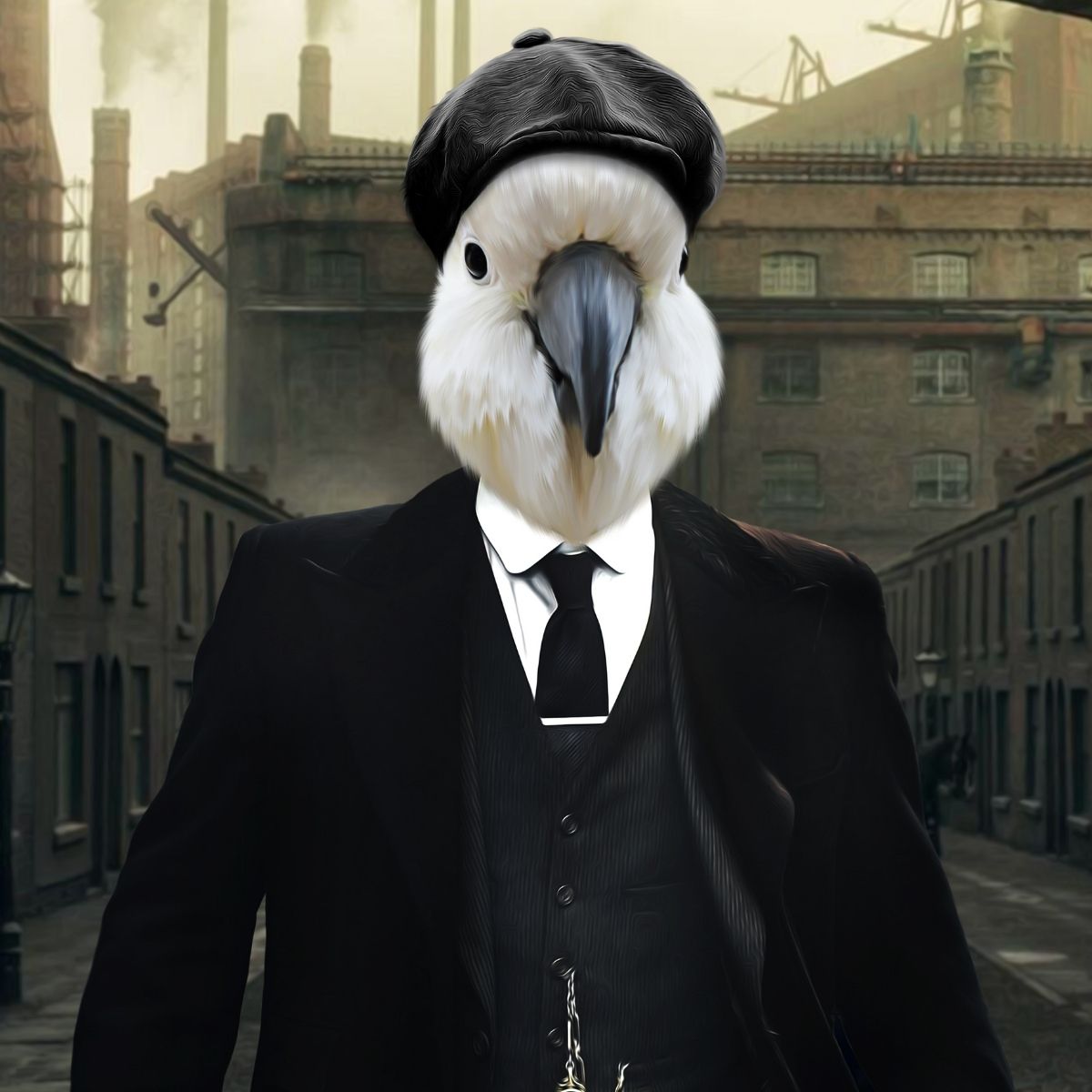
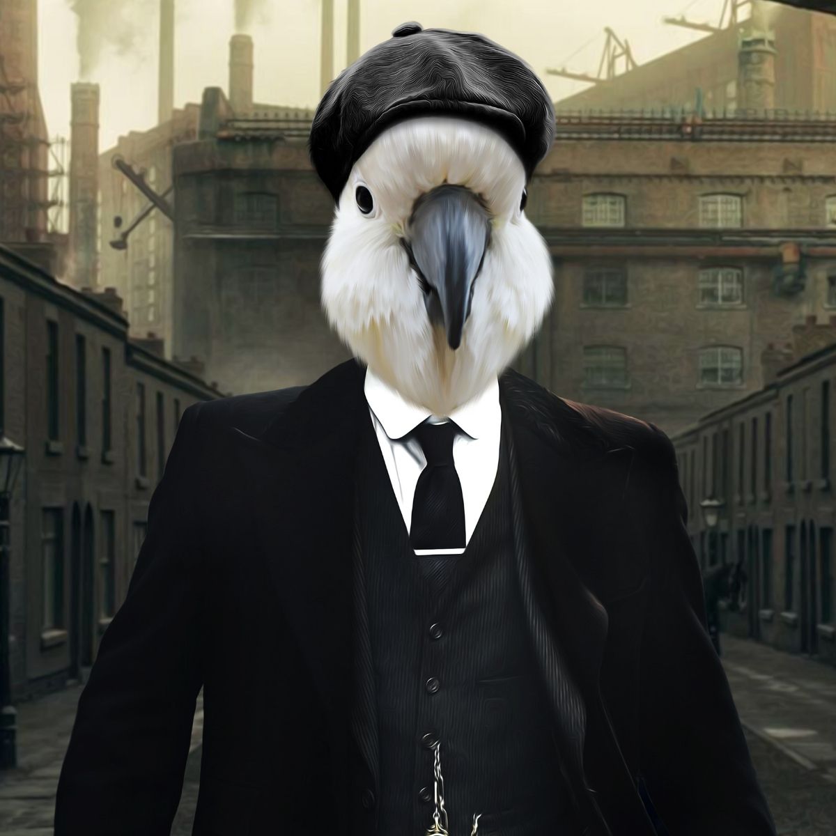
For many designs, the pet should remain the clear focal point. If your chosen custom portrait supports a name or text option, use it with restraint and check the final spelling, placement and balance in the Artwork Preview before approving the piece for print.
There is no rule that a personalised pet portrait needs text. The portrait is already personal because it is based on your own dog, cat or other pet.
A name works particularly well when:
Leaving the name off can be better when the artwork is already detailed, the composition is very small or the portrait style is intended to feel like traditional wall art rather than a personalised print.
Your pet’s everyday name is usually enough. “Milo” gives the artwork breathing room. “Sir Milo Theodore Waffles, Defender of the Kitchen” may be technically accurate but starts to compete with the face.
If you use a nickname, choose the one the recipient actually uses. A personalised gift feels much more personal when it does not reveal that the person ordering it knows the dog mainly from Instagram.
A name normally works best below the portrait, above it with generous spacing or in a deliberately reserved text area.
Avoid placing lettering across important facial features, ears, whiskers or coat markings. Those details are part of what makes a custom portrait recognisable in the first place.
If the source image is tightly cropped, a simpler text treatment usually works better than trying to squeeze a decorative title into the remaining space.
The typography should look as though it belongs to the portrait.
For a clean modern portrait, a simple serif or sans-serif name can work well. A classic or royal portrait can carry a more traditional type treatment. Cartoon and playful artwork can tolerate something lighter, provided the lettering still reads clearly at print size.
Mixing three decorative fonts in one pet portrait is rarely a sign of increased affection. It is usually a sign that the font menu was left unsupervised.
The pet’s name does not need to be the brightest object in the composition.
Choose a colour that connects to the background, frame or portrait palette while maintaining enough contrast to remain readable. Dark navy, charcoal, black, warm neutral tones and softened colours often sit more naturally than very bright lettering.
If the portrait already uses bold colour, the name can be calmer. If the artwork is minimal, a small contrast can give the text enough presence without becoming the main event.
For your own pet, use whichever version makes you smile when you see it every day. For a gift, use the name the recipient normally says.
Official kennel names, long registered names and elaborate titles can be amusing, but check whether the finished artwork has enough width. A short nickname is often easier to balance visually.
For a memorial portrait, the familiar everyday name is usually the gentler choice because it reflects the relationship rather than the paperwork.
A pet portrait with a name does not automatically need a birth date, adoption date, quote, location and heartfelt paragraph underneath it.
Additional text can make sense for a memorial, anniversary or specific gift, but each extra line changes the artwork from a portrait into a more text-led keepsake.
Ask what you want the viewer to notice first. If the answer is the pet, keep secondary wording genuinely secondary.
Typography can look perfectly balanced on a large screen and then become too small, too dominant or oddly spaced when printed.
Consider the physical size of the finished portrait. Smaller prints normally need simpler, clearer text. Larger wall art gives more room for spacing, but that does not mean every available centimetre needs filling.
For help choosing the artwork dimensions themselves, see our pet portrait size guide.
No. Text and name options depend on the portrait design and the current product configuration.
If adding your pet’s name is important, check the live product page before ordering rather than assuming every design includes the same customisation. Some artworks are intentionally cleaner without text, while others are designed to incorporate it.
You can browse the current custom pet portrait collection and choose a style that suits both your pet and the amount of personalisation you want.
Adding a name can be particularly useful for gifts because it makes the artwork feel deliberately made for that household.
Good occasions include birthdays, Christmas, anniversaries, housewarmings and gifts for someone who has recently welcomed a new pet.
Before ordering a surprise portrait, check three things:
Our custom pet portrait gift guide covers photo choice, size, surprise gifts and display options in more detail.
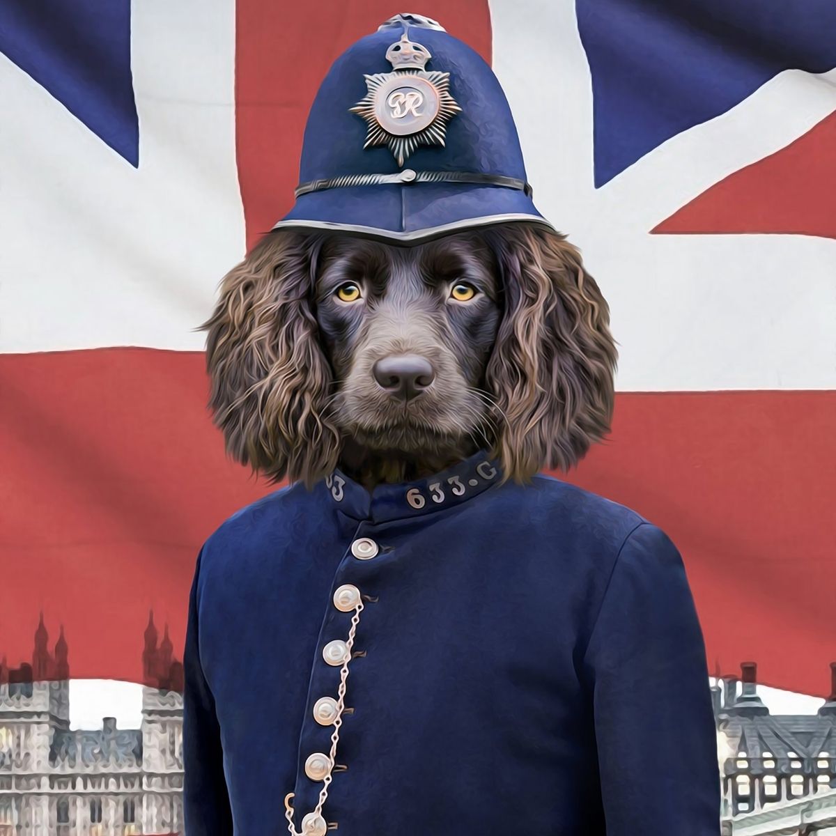
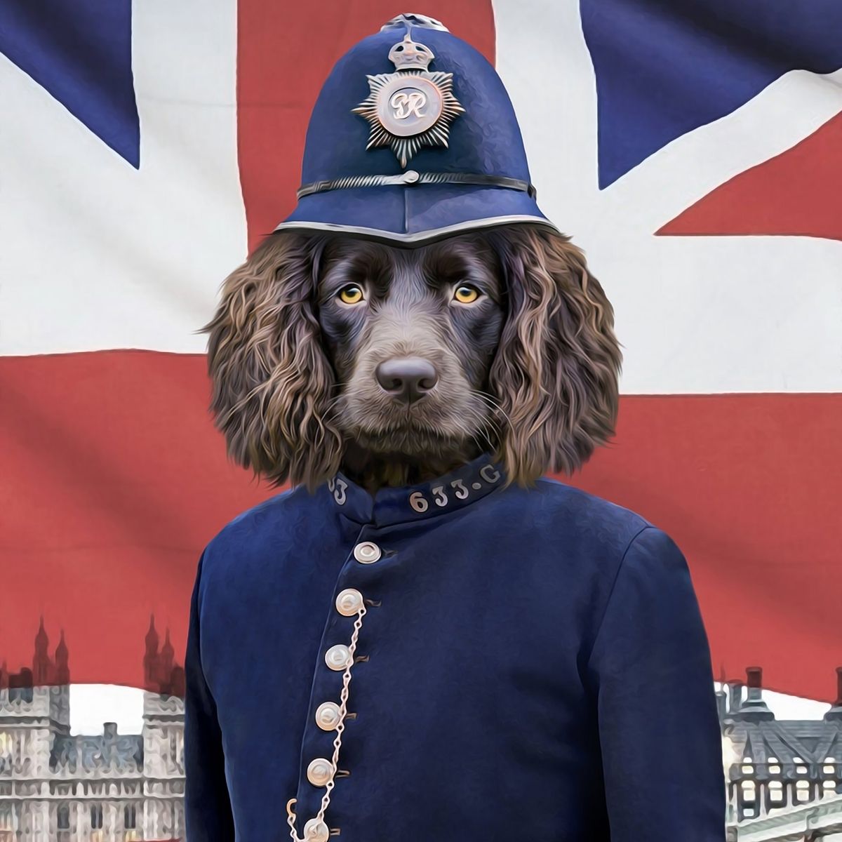
For a dog portrait, the name often works well beneath a head-and-shoulders composition or as a small title within a poster-style design.
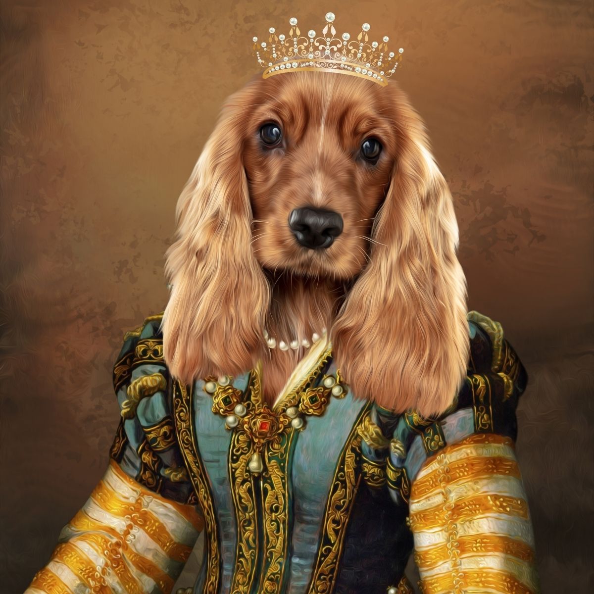
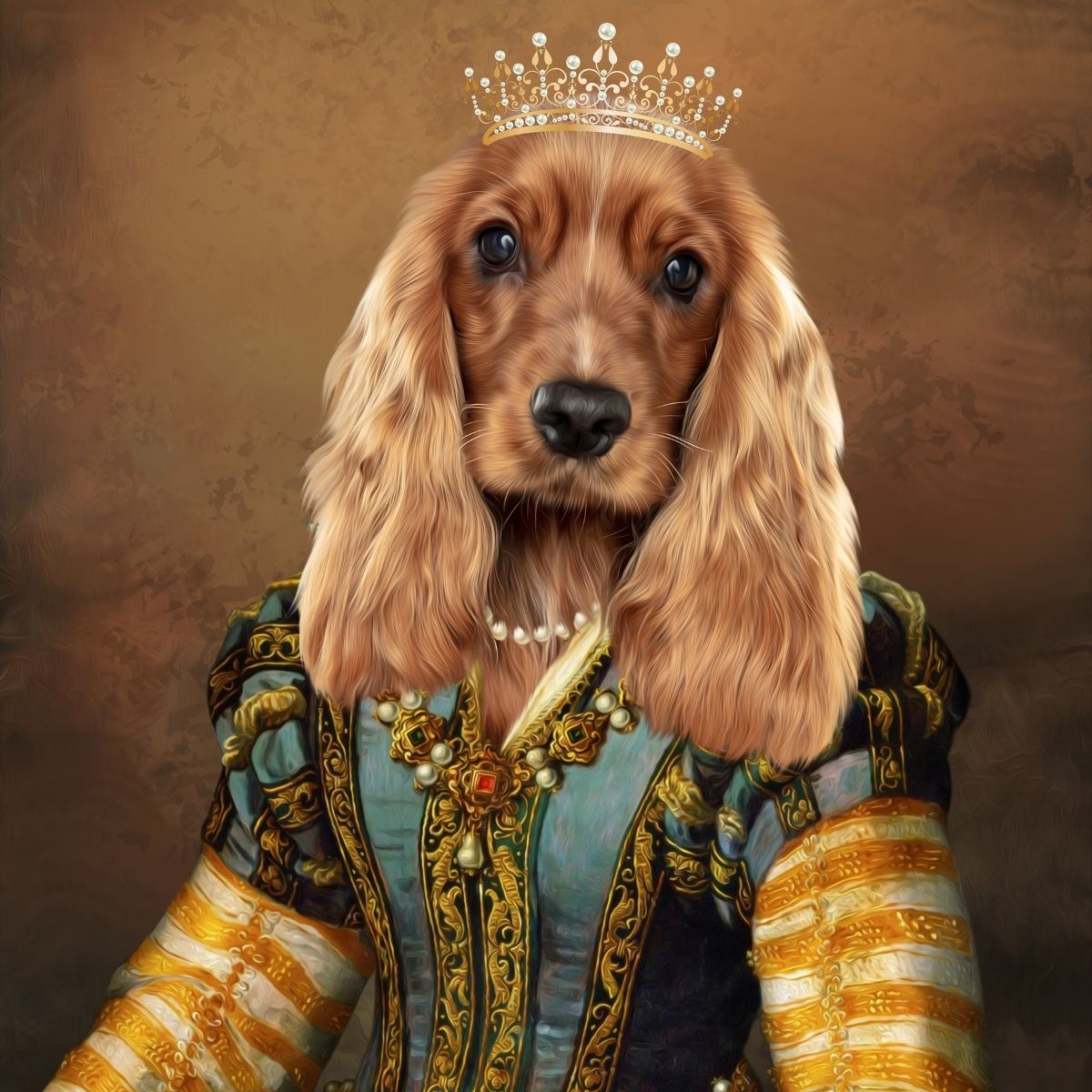
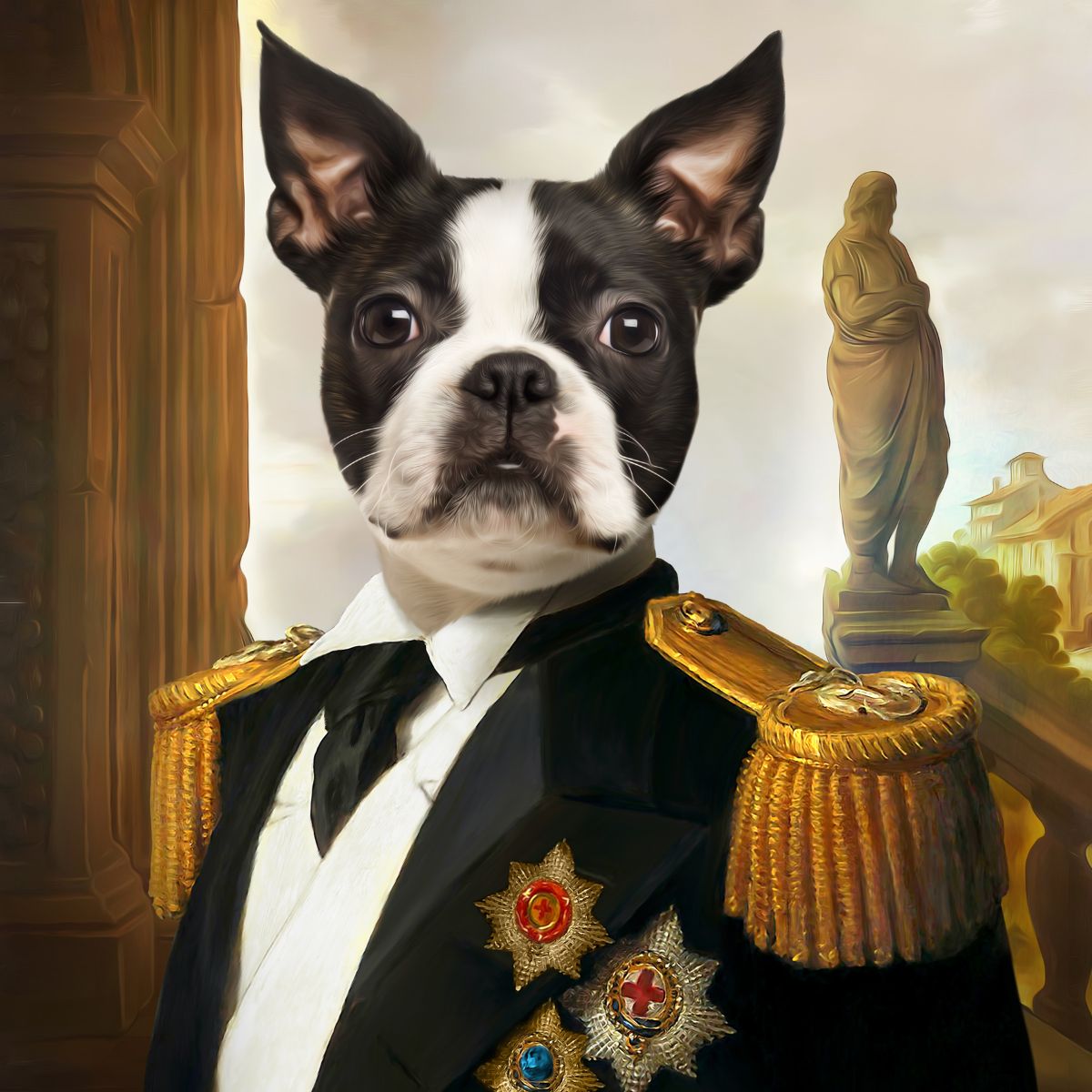
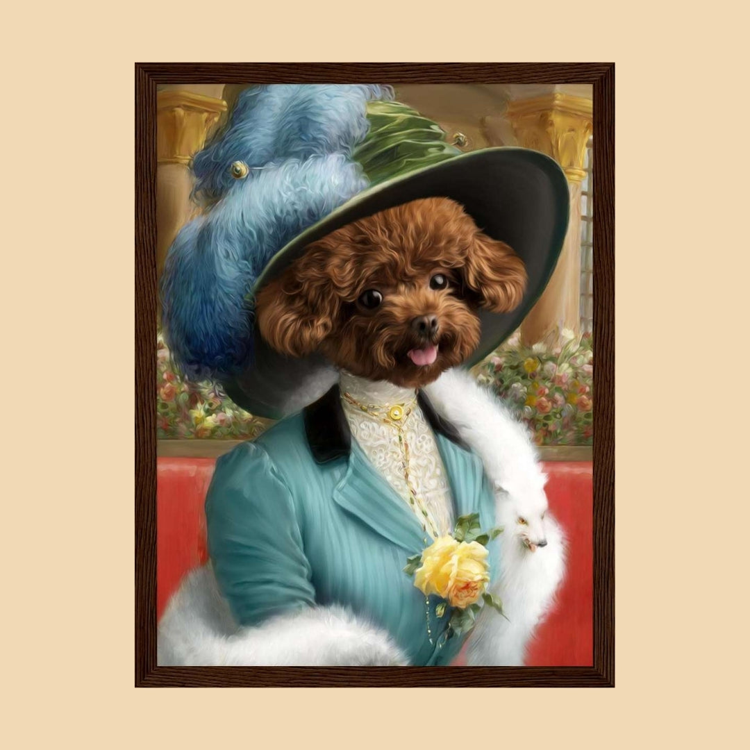
If the dog has distinctive ears, a long coat or a costume portrait with lots of detail, avoid adding text so close that it crowds the silhouette.
Expression matters too. A bold themed portrait of a very serious dog can carry a stronger title treatment. A soft minimalist portrait may look better with small, restrained lettering or no text at all.
Cat portraits often rely heavily on the eyes, whiskers, ear shape and coat markings. Those features should not be sacrificed simply to make room for a name.
Place the text in a clean area and preserve contrast around the face. If your cat has a long name, test whether a shorter familiar version creates a better composition.
For source-photo advice that applies to both dogs and cats, read our pet portrait from photo guide.
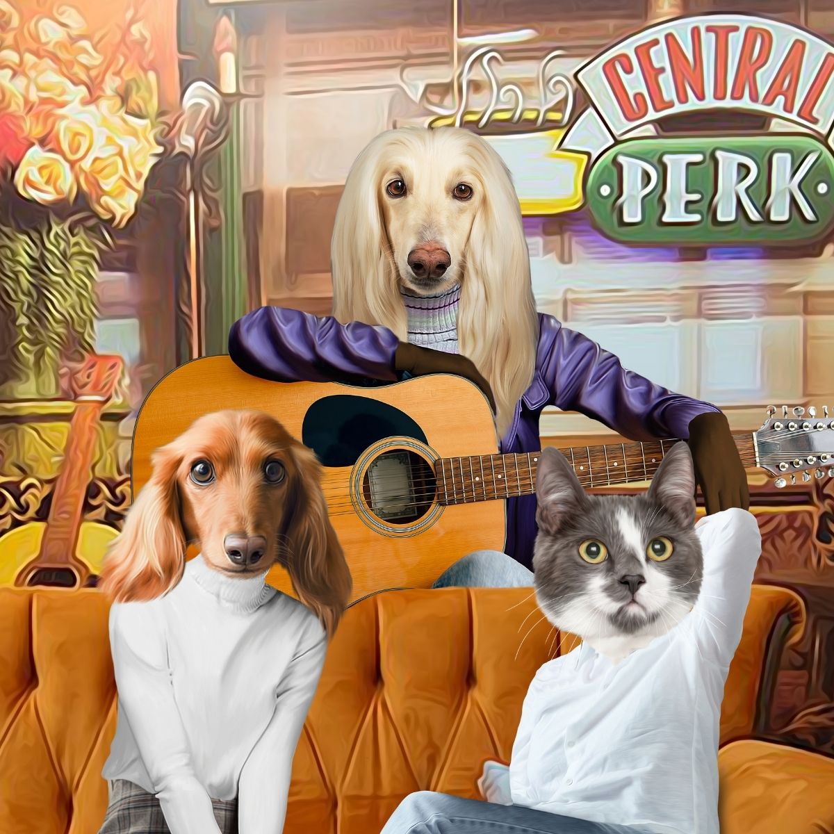
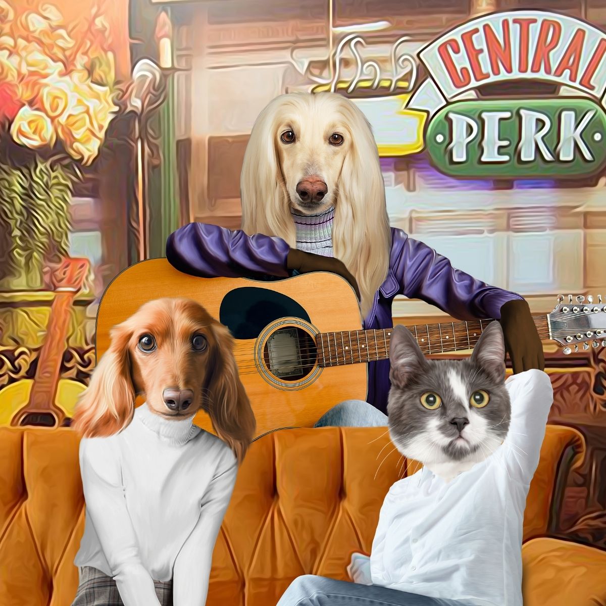
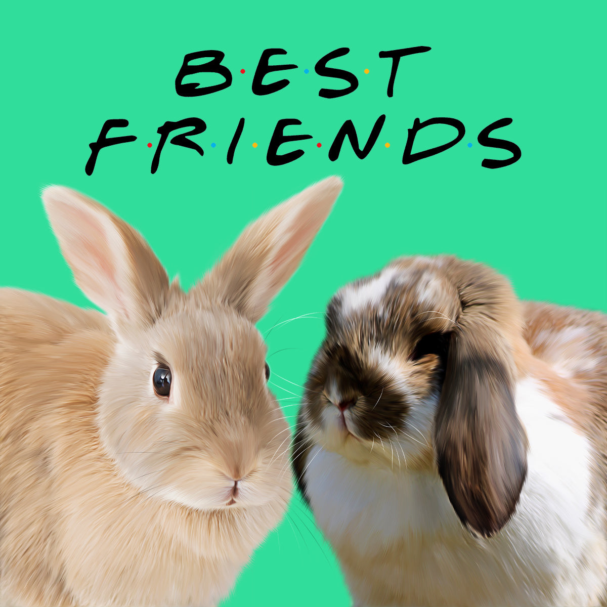
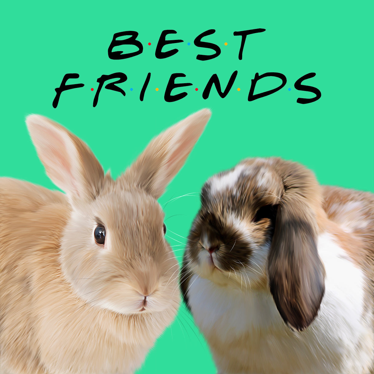
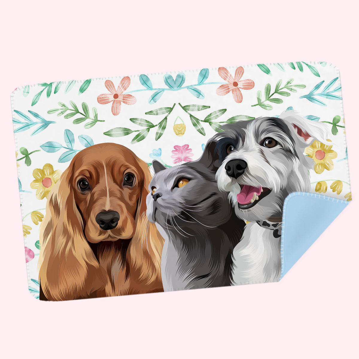
Names can help on a multi-pet portrait, but they are not always necessary.
If every pet looks very different, the artwork may be stronger without labels. If two pets are visually similar or the portrait is intended as a family record, small names can add useful identification.
Keep the typography consistent. Giving one pet elegant serif lettering and another a completely different handwritten style suggests a domestic hierarchy nobody asked to document.
Also check that the chosen design supports the number of pets and any text customisation you require. Product options vary.
It can, but it does not have to.
For a memorial portrait, the pet’s familiar name can add meaning without making the artwork feel overly sentimental. A simple name on its own is often enough.
If you also want dates or a short message, keep the portrait visually calm and choose wording the recipient will genuinely want to see every day. There is no obligation to turn remembrance artwork into an inscription simply because the option exists.
This sounds painfully obvious, which is usually when spelling mistakes become ambitious.
Before approving custom text, check:
Do not rely on what you think you typed at checkout. Read the Artwork Preview itself.
Paw & Glory custom portrait orders receive an Artwork Preview before printing, giving you the opportunity to review the artwork and request changes before approval.
It should primarily match the artwork, but thinking about the room helps.
If the portrait will sit in a calm neutral space, understated text will usually integrate more easily. In a colourful gallery wall, a stronger name treatment can work because the surrounding room already carries visual energy.
Our pet portrait style quiz can help if you are deciding between modern, classic, funny and more decorative approaches.
Some portrait designs support names or other text, while others are designed without it. Check the current product options for the specific portrait you choose.
Below the portrait or in a clean reserved area is usually safest. Keep lettering away from the eyes, ears, whiskers and distinctive coat markings.
Use a font that matches the artwork style and remains easy to read at the final print size. Simple typography usually ages better than highly decorative lettering.
Use the name the owner actually calls the dog. A shorter familiar nickname can also be easier to balance within the design.
Where the selected design supports text and multiple pets, names may work well. Keep the font treatment consistent and avoid crowding the individual portraits.
No. A memorial portrait can be meaningful with or without text. If you include a name, simple familiar wording is often enough.
The name should support the artwork, not compete with it. Keep the wording short, typography consistent and the pet’s face unmistakably in charge.
Browse our custom pet portraits to compare current designs and customisation options. Your pet already supplies the personality. The typography does not need to perform a second audition.
Comments will be approved before showing up.
September 09, 2026 5 min read
WELCOME TO PAW & GLORY
Get up to 30% off
Join 30,000+ pet owners turning perfectly ordinary photos into gloriously over-the-top works of art.
★★★★★ 2,200+ Five-Star Reviews
Real Artists · Proof Before Print · Unlimited Artwork Revisions