August 01, 2024 4 min read
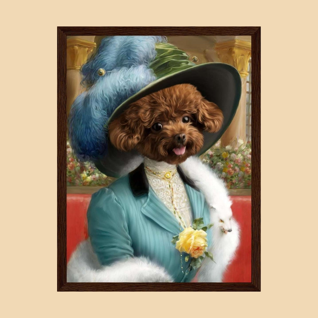
The best frame colour for a pet portrait is usually the one that connects the artwork to the room without competing with the pet’s face. Black can add definition, white can keep the presentation lighter, and natural wood can introduce warmth. The right choice depends on the artwork colours, wall, furniture and the other frames already in the space.
Frame options vary between portrait products, so use the live product page for the choices actually available before ordering. This guide is about deciding which visual direction suits the artwork and room.
A black frame creates a clear visual boundary and can suit modern, graphic or high-contrast artwork. It often works well when the portrait already contains dark details or the room uses black lighting, handles, furniture legs or other small accents.
Be more careful when the artwork itself is very dark. A black frame around a dark background can create a heavier overall block than you intended, particularly on a smaller wall.
A white or very light frame can keep colourful artwork feeling clean and can suit pale walls, Scandinavian-style interiors and rooms with lighter furniture.
It can also create useful breathing space around portraits with strong background colours. If the wall is also white, the frame may visually recede and let the artwork carry more of the contrast.
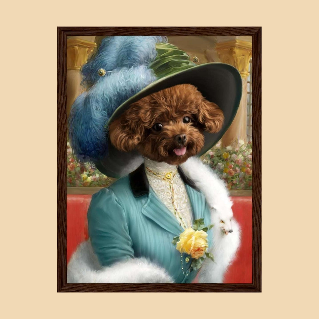
Wood tones can introduce warmth and often sit comfortably beside cream, beige, taupe, green and other natural interior colours. They can suit both traditional and contemporary rooms depending on the finish.
Compare the wood with nearby flooring, shelves and furniture. It does not need to match every timber exactly. A room assembled entirely through perfect matching tends to look more like a catalogue exercise than somewhere humans actually live.
Not necessarily. The frame is part of the room as well as the portrait. A black dog does not automatically require a black frame, and a pale cat does not need a white one.
Instead, look at the complete artwork: pet, background, clothing or design elements, and the wall where it will hang.
It can either repeat a colour already in the artwork or provide deliberate contrast. If the background is very bold, a restrained frame often lets the artwork remain the focal point.
If you are still deciding on the artwork itself, see our background colour guide for custom pet portraits.
Look at nearby photographs, mirrors and artwork. Repeating one existing frame finish can help a new pet portrait feel connected to the rest of the room, particularly in a gallery wall.
That does not mean every frame must match. Mixed frames can work well when there is another repeated feature such as colour, spacing or artwork style.
Neutral rooms give you several directions. Black creates stronger contrast. White stays quieter. Wood introduces warmth. Use the rest of the room to decide whether the portrait should blend into the scheme or become a more obvious focal point.
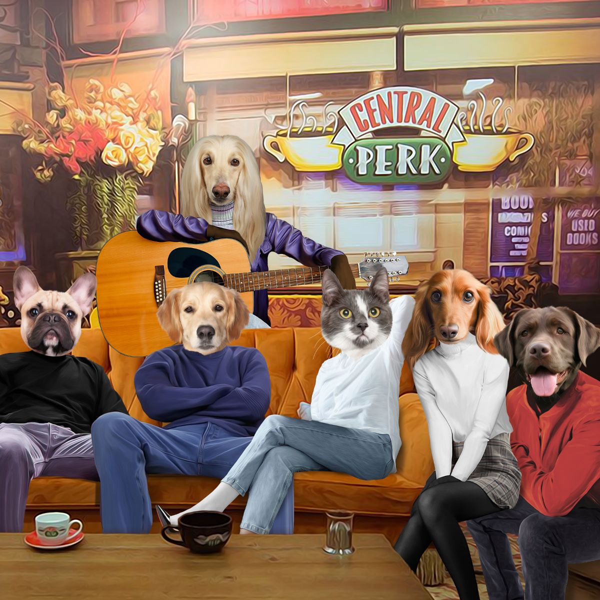
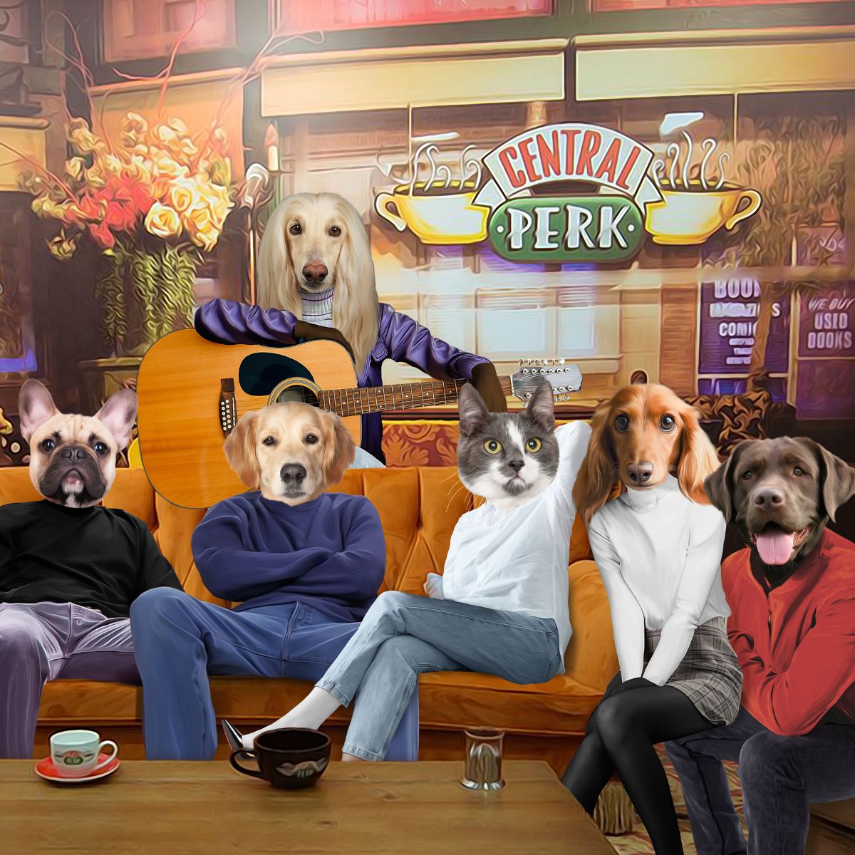
When the artwork already contains several strong colours, a simpler frame can stop the overall presentation becoming visually crowded. Black, white or a restrained wood finish can all work depending on the wall and colour palette.
For bolder artwork directions, compare our pop art pet portrait guide and modern pet portrait styles.
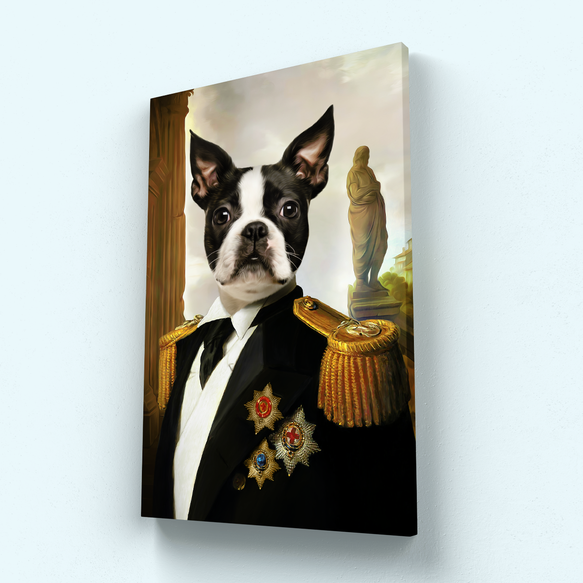
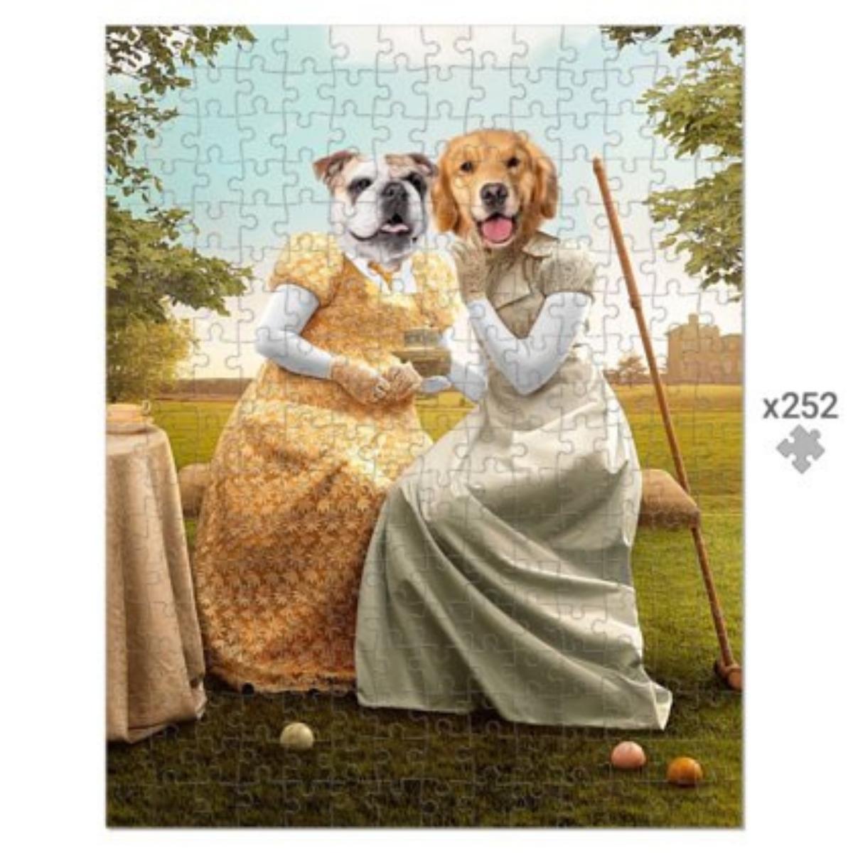
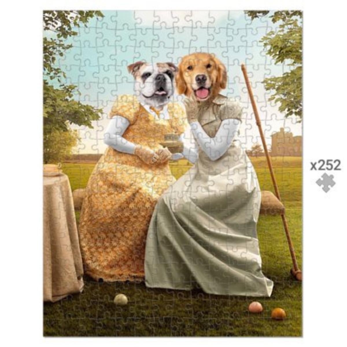
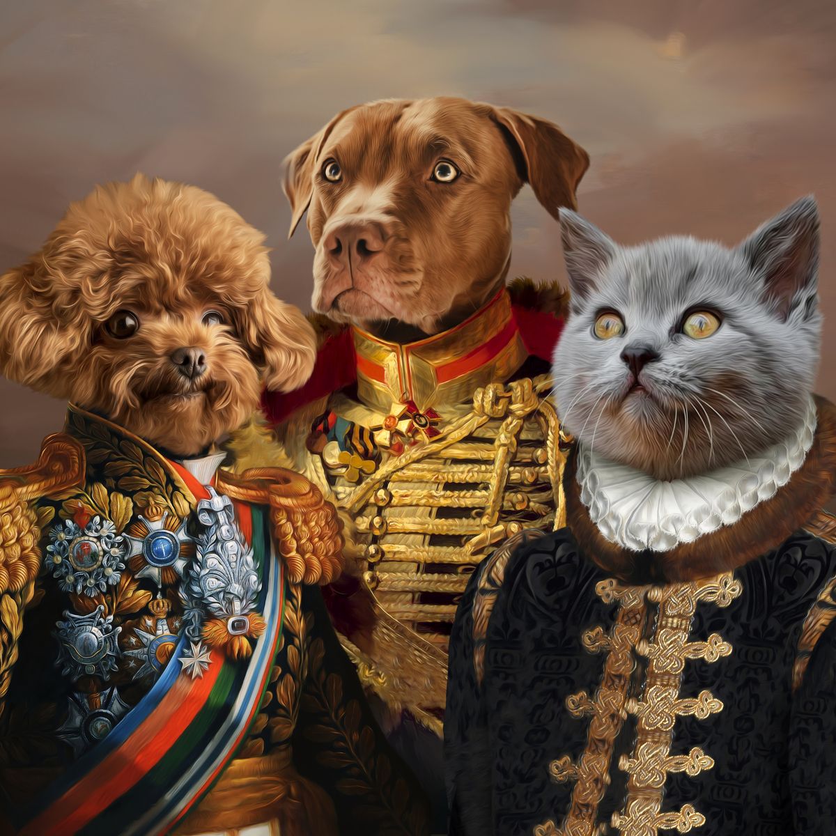
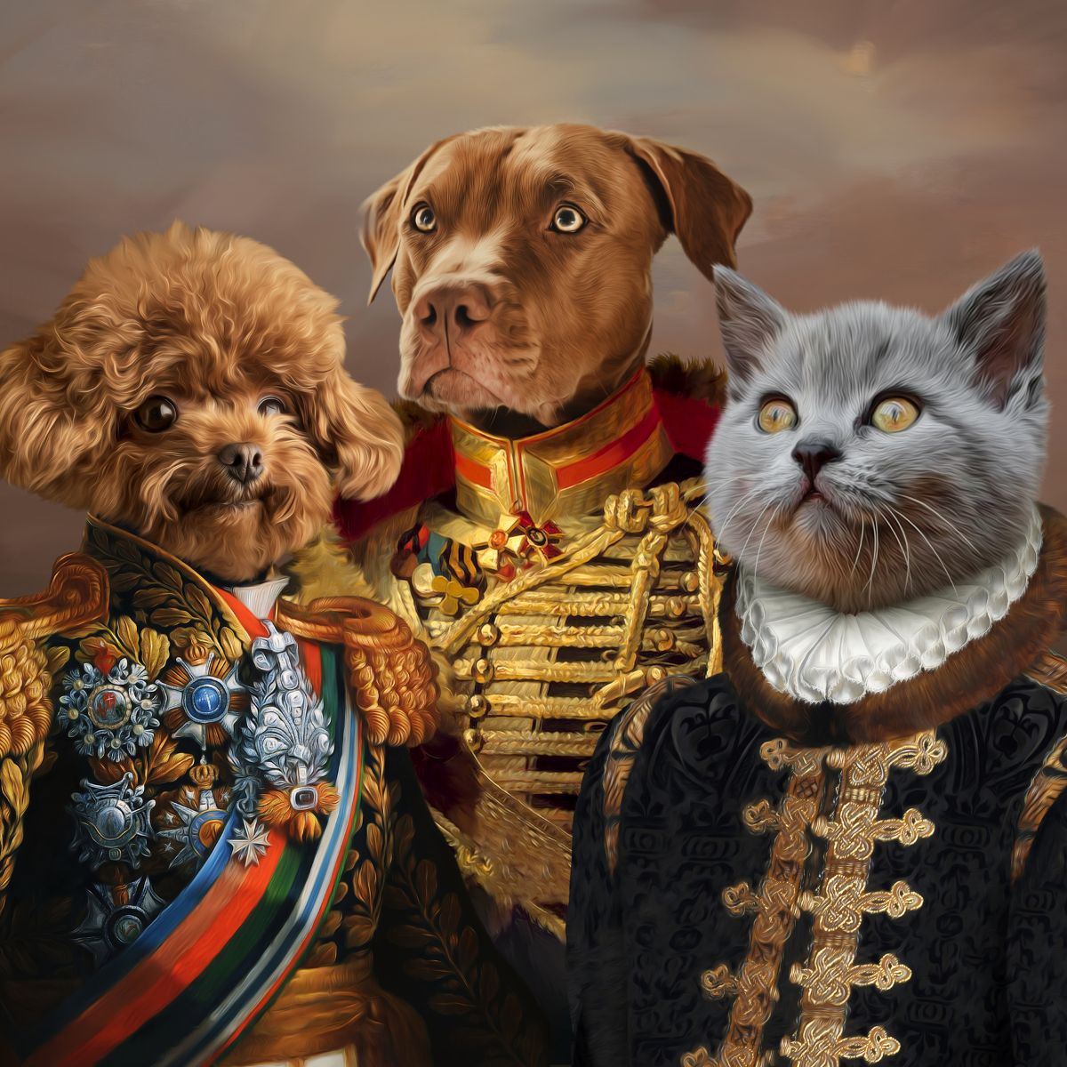
Formal portrait styling can suit a frame with enough visual weight to feel intentional, but the frame does not need to compete with elaborate clothing, gold tones or a dramatic background.
See our royal pet portraits UK guide for the artwork side of that decision.
For memorial artwork, choose a frame that feels comfortable in the intended room rather than assuming remembrance requires a particular colour. Some people prefer quiet neutral presentation; others use a frame that connects with existing family photographs.
Our pet memorial portraits UK guide covers the wider photo, text and style choices.
If you are uncertain, place the portrait image on your screen beside photographs of the room, or use simple black, white and wood-coloured paper around a printed reference. You are not producing a museum-grade mock-up. You are checking whether one option suddenly makes the artwork look much heavier, colder or warmer.
There is no universal safest colour. Black gives definition, but white or wood may suit a lighter or warmer room better.
No. Matching can create a very ordered display, while mixed frames can work when spacing or colour creates enough visual consistency.
You can, but it is usually easier to choose the artwork first. The colours and visual weight of the finished design give you more useful information for the frame decision.
Browse the current framed pet portrait collection for live designs, sizes and available frame options.
A frame should help the portrait feel at home in the room. Start with the artwork, look at the wall and surrounding finishes, then choose the frame colour that makes the entire piece feel deliberate rather than whichever option sounded safest in isolation.
Comments will be approved before showing up.
September 09, 2026 5 min read
WELCOME TO PAW & GLORY
Get up to 30% off
Join 30,000+ pet owners turning perfectly ordinary photos into gloriously over-the-top works of art.
★★★★★ 2,200+ Five-Star Reviews
Real Artists · Proof Before Print · Unlimited Artwork Revisions